
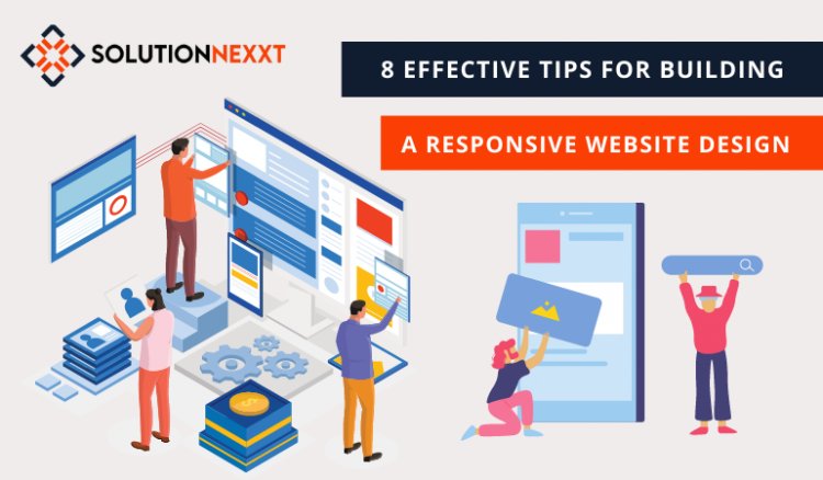
8 Effective Tips for Building a Responsive Website Design
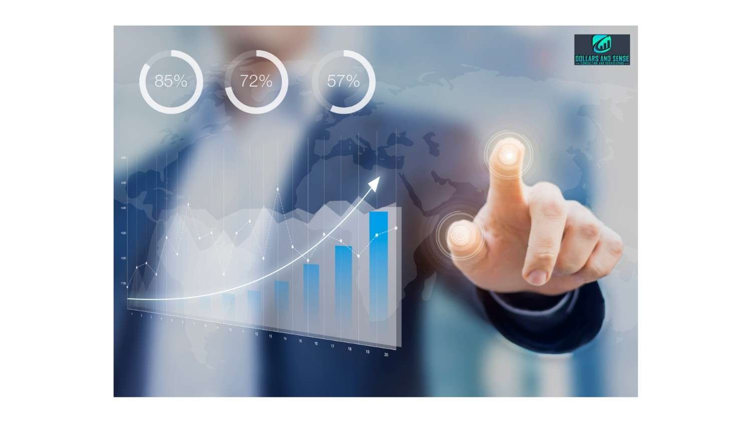
As a business owner, you should be aware of whether your website has a high conversion rate. Knowing the insights, you should be able to determine the next steps to improve your website. If you are unable to find a reliable and scalable website design company, contact them.
 solutionnexxt
0
200
